Did you ever get overwhelmed trying to understand all different log message of an application? In this post I’d like to share how to analyze application logs combining different open source projects to produce an appealing dashboard summarizing all information.
We will use a github repository with a collection of algorithms to parse logs, logparser, plotly to create interactive plots, and pandas to transform data.
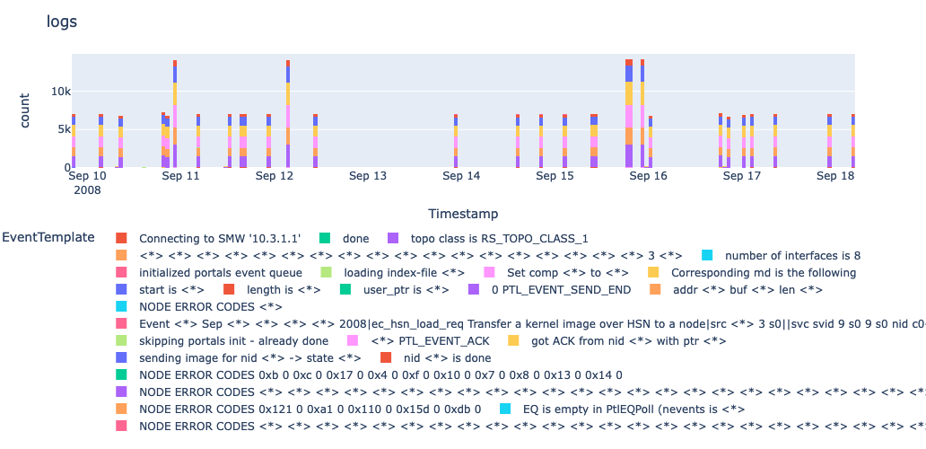
For starters, we will by briefly explain the dependencies and datasets used, and later we show how to obtain a dashboard like the following.
Let us get started!
Dependencies
Logparser
The first and main dependency is the repository logparser which consists of a collection of algorithms to parse logs. Furthermore, the repository includes articles explaining each algorithm to great extent.
One of the algorithm that works quite well is Spell and we will use it throughout the post. Spell works well in most scenarios since it is fast, requires no pre-defined log templates or regular expressions, and parses logs in an online streaming fashion, so it is able to start parsing logs immediately.
The accuracy of Spell is also supported by multiple benchmarks collected in logparser and its performance is often one of the best amongst the options tested.
This algorithm processes a stream of logs by associating each incoming log to the element from a growing list of log templates that shares the longest common subsequence with it. If the incoming log is very different from the current log templates, then a new log template is added to the list. The parameter tau can also be tweaked to manage the number of log templates.
Remark: In this blog we added some small modifications to the code provided in the logparser repository since that was developed with Windows machines in mind and it behaves slightly differently in our machines that run macOS.
Example
As a short example, we can see what happens as the following logs are processed using the Spell algorithm.
The ducks waddled in the park.
The ducks walkded in the park.
The ducks flew in the air.
The cat chased birds in the Spark.
After the first two lines are read, they are associated with the same log template as shown below. Note that the positions where the log lines differ are omited from the log template and the corresponding tokens are considered parameters.
| Log Template | Parameter List |
|---|---|
| The ducks <*> in the park. | [‘waddled’] |
| The ducks <*> in the park. | [‘walkded’] |
Then, we note that the third line still has a significant substring in common with the previous log template, so it is grouped with the previous log messages. Finally, the last line does have a substring longer than half of its length in common with the log template, so it originates a new log template.
| Log Template | Parameter List |
|---|---|
| The ducks <*> in the <*>. | [‘waddled’, park] |
| The ducks <*> in the <*>. | [‘walkded’, park] |
| The ducks <*> in the <*>. | [‘flew’ , air] |
| The cat chased birds in the park. | [] |
Cray Data
We use log data shared by usenix, specifically the log dataset corresponding to Cray Supercomputer. This file has close to 250K log lines.
Here is a sample of the logs.
[Tue Sep  9 20:18:34 2008]:

Boot Node Daemon starting at Tue Sep  9 20:18:34 2008.
[Tue Sep  9 20:18:34 2008]:Connecting to SMW '10.3.1.1'
[Tue Sep  9 20:18:34 2008]:done
[Tue Sep  9 20:18:34 2008]:topo class is RS_TOPO_CLASS_1
[Tue Sep  9 20:18:38 2008]:Event:Tue Sep  9 20:18:40 2008|ec_hsn_load_req Transfer a kernel image over HSN to a node|src:1b:3:s0||svc: svid=:9:s0:9:s0 nid=c0-0c0s0n3  bparams='' kpath='/tmp/boot/kernel.cpio.2.1.31HD-13426' flags=0x3
[Tue Sep  9 20:18:38 2008]:
***** HSN Booting 1 nodes at Tue Sep  9 20:18:38 2008
[Tue Sep  9 20:18:38 2008]:number of interfaces is 8
[Tue Sep  9 20:18:38 2008]:initialized portals event queue
[Tue Sep  9 20:18:41 2008]:loading index-file /tmp/boot_9lDixW/SNL0.load
[Tue Sep  9 20:18:41 2008]:Set comp mdh[0] to 0x0
[Tue Sep  9 20:18:41 2008]:Corresponding md is the following:
[Tue Sep  9 20:18:41 2008]:start  is 0x2b20e175b010
As you can see, each log line start with a timestamp and is followed by a message.
Dashboard
Putting together all the pieces mentioned above we can obtain the following dashboard. You can also produce the same plot using this notebook.
Aside from grouping similar logs, we can also see their timestamps and infer whether the log messages were sporadic or recurrent.
Parsing logs
After downloading the logs files, the following code snippet injests the log messages and producces two CSV files, one listing all the log templates and another listing all log messages with their corresponding log templates and parameters.
import pandas as pd
from logparser.Spell import Spell

t = "data/0809181018"
parser = Spell.LogParser(log_format="\[<Timestamp>\]:<Content>", indir=t, outdir=t, tau=0.5)
parser.parse("bnd.log")
As an example, here is part of the output file that includes the log messages.
| LineId | Timestamp | Content | EventId | EventTemplate | ParameterList |
|---|---|---|---|---|---|
| 11 | Tue Sep 9 20:18:41 2008 | Corresponding md is the following: | 1cbf7853 | Corresponding md is the following | [] |
| 12 | Tue Sep 9 20:18:41 2008 | start is 0x2b20e175b010 | 365695dc | start is <*> | [‘0x2b20e175b010’] |
| 13 | Tue Sep 9 20:18:41 2008 | length is 0x3ffb28 | f3cb5b83 | length is <*> | [‘0x3ffb28’] |
| 14 | Tue Sep 9 20:18:41 2008 | user_ptr is 0x3e9 | 7d7147f1 | user_ptr is <*> | [‘0x3e9’] |
| 15 | Tue Sep 9 20:18:41 2008 | Set comp mdh[1] to 0x1 | 2bab36e2 | Set comp <> to <> | “[‘mdh[1]’, ‘0x1’]” |
Timestamps
In order to convert the Timestamp column into an actual time we use regular expressions to extract the year, month, day and time from the the existing field.
from calendar import math_abbr

df.assign(
    Timestamp=lambda x0:
    x0["Timestamp"]
    .str.extract(r"\S+\s+(?P<m>\S+)\s+(?P<d>\S+)\s+(?P<t>\S+)\s+(?P<y>\S+)")
    .replace(dict(zip(month_abbr, range(13))))
    .assign(m=lambda x: x["m"].astype(str).str.rjust(2, "0"))
    .assign(d=lambda x: x["d"].astype(str).str.rjust(2, "0"))
    .pipe(lambda x: pd.to_datetime(x["y"] + "-" + x["m"] + "-" + x["d"] + " " + x["t"])))
Plot Result
We use the plotly.express module to concisely create the histogram with the different log templates. Note that we plot time in the x-axis, and we position the legend below the graph, instead of next to it.
import plotly.express as px

df = pd.read_csv(next(Path(t).glob("*_structured.csv")))

(
    px.histogram(
        df
        .assign(
            Timestamp=lambda x0:
            x0["Timestamp"]
            .str.extract(r"\S+\s+(?P<m>\S+)\s+(?P<d>\S+)\s+(?P<t>\S+)\s+(?P<y>\S+)")
            .replace(dict(zip(month_abbr, range(13))))
            .assign(m=lambda x: x["m"].astype(str).str.rjust(2, "0"))
            .assign(d=lambda x: x["d"].astype(str).str.rjust(2, "0"))
            .pipe(lambda x: pd.to_datetime(x["y"] + "-" + x["m"] + "-" + x["d"] + " " + x["t"])))
        [["Timestamp", "EventTemplate"]],
        x="Timestamp",
        color="EventTemplate",
        nbins=288)
    .update_layout(height=500, legend=dict(y=-0.5, orientation="h"), title="logs")
    .show()
)
Once again, here is the final result.
Again, the dashboard can be produced using this notebook.
Conclusion
Throughout this post we describe some basic building blocks to produce insights from log messages.
I hope you enjoyed it!